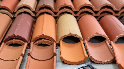
How to Choose Plain Tiles for Your Space?
Plain tiles may look simple, but their finish, scale, and placement can change the whole feel of a room. A soft white tile can brighten a shaded kitchen, while warm beige or muted grey can make a busy hallway feel calmer. Even small details matter: grout shade, edge shape, and the way daylight moves across a glossy surface. There is no single best choice. A tile that looks elegant in a showroom may feel cold under your own lighting.
William Morris, the designer and craftsman, offered a useful principle: “Have nothing in your houses that you do not know to be useful, or believe to be beautiful.” It is not a tile-industry quotation, but it fits the decision well. Choose plain tiles for the job they must do, and for how you want the room to feel. Check samples against cabinets, flooring, and natural light. Look at them in the morning and again at night. Small samples can mislead.
This guide will help you compare tile material, size, color, finish, and maintenance needs before choosing. It will also consider practical details, such as whether a polished surface suits a wet area or a matte finish hides everyday marks better. Ask an experienced tile installer to assess the surface and layout; even a lovely tile can disappoint when the setting is uneven. And one honest caution: plain tiles do not automatically make a room timeless. Proportion and installation still matter.
Assess Room Use, Moisture Exposure, and Required Tile Performance
Choose plain tiles by how a room is used, not by color alone. A kitchen floor faces spills, dropped utensils, and frequent cleaning. A quiet bedroom may need less abrasion resistance, while an entryway handles grit tracked in on shoes. Note where water collects: beside a shower, near a sink, or at an exterior door. Small details matter.
For wet, level interior floors, ANSI A137.1 specifies a minimum wet dynamic coefficient of friction, or DCOF, of 0.42. The Tile Council of North America cautions that this test value does not guarantee safety in every condition. Soap, oily residue, footwear, and slope can change traction. A glossy tile may look calm and clean, yet feel less forgiving when wet. Test a sample under realistic lighting and cleaning conditions.
Moisture exposure also affects material choice. Under ASTM C373, porcelain tile is classified by water absorption of 0.5% or less; this can suit persistently damp areas, though installation and grout still matter. Check the manufacturer’s technical sheet for water absorption, abrasion rating, and recommended applications. Do not assume every plain tile performs alike. I would compare two samples side by side, then reconsider after seeing them with water on the surface.
Choose Plain-Tile Color, Finish, and Format for the Room’s Light and Scale
Plain tiles can look different from one wall to another because light changes their color. A cool white tile may appear crisp beside a sunny window, then feel blue under evening LEDs. Warm gray often softens that shift, while deep colors can make a dim room feel smaller. Check samples in the actual room. View them morning, afternoon, and after dark.
Finish affects both appearance and upkeep. Glossy surfaces bounce light around, which can brighten a narrow hallway, but they also reveal glare and water marks. Matte tiles give a quieter look and can feel more forgiving on large walls. For floors, check the tile’s slip rating and care guidance rather than judging from a sample alone. Small details matter.
Format should suit the room’s scale and layout. Large tiles reduce grout lines and can make a compact space feel calmer, though awkward cuts may waste material in a small alcove. Smaller formats work around drains and corners, but extra grout needs regular cleaning. A common mistake is choosing from a showroom’s bright lighting. I would map the tile against the room’s widest wall and check several full-size pieces before ordering; one sample rarely shows the whole effect.
Check Wet-Floor Slip Data: ANSI A326.3 Sets DCOF ≥0.42 for Level Interiors
Plain tiles can make a room feel calm, but a smooth-looking surface still needs careful checking. For level interior floors that may get wet, ANSI A326.3 uses a wet dynamic coefficient of friction, or DCOF, of at least 0.42 as a reference point. Ask for the tile’s test data, not just a showroom description. That number matters.
A DCOF result does not guarantee that a floor will never be slippery. Water, soap, dust, footwear, and cleaning habits can all change how a surface feels underfoot. A polished tile may look elegant beside a bathtub, yet become a poor fit where splashes collect. Think about the room’s real use: a kitchen near the sink differs from a dry hallway. Small details count.
Check that the test information applies to the tile and finish you plan to buy. If possible, view a sample under bright light and feel its surface with a damp hand; this is only a rough check, not a substitute for standardized testing. I would not choose by appearance alone. The 0.42 figure is useful, but context still matters. A level-floor rating may not address ramps, heavy contamination, or every user’s needs, so ask a qualified flooring professional when conditions are unusual.
Verify Shade and Caliber, Then Calculate Tile Quantity and Cutting Allowance
Before ordering plain tiles, compare shade and caliber codes on every carton; matching color names alone is not enough. ANSI A137.1 sets industry requirements for ceramic tile, including dimensional and visual characteristics, while the Tile Council of North America’s Handbook provides installation guidance. Ask the supplier to confirm that all boxes come from the same production lot. Open several cartons and place tiles together under the room’s actual lighting. A pale gray tile can look warmer beside a window than beneath a warehouse lamp. Check the printed size, too: nominal dimensions may differ from actual caliber. One easy detail to miss.
Measure the net floor area, then divide by the coverage of one tile. For example, a 120-square-foot room using 12-by-24-inch tiles needs 60 tiles before waste, since each covers 2 square feet. Add about 10% for a straightforward layout; allow closer to 15% for diagonal patterns, many corners, or fragile handling. These are practical trade estimating allowances, not guarantees. Recheck the calculation against the installer’s layout, especially around doorways and narrow edges. A neat spreadsheet can still underestimate awkward cuts.
Tips: Keep a spare carton from the same shade and caliber. Label it, store it flat, and retain the packaging codes. For a simple room, 10% extra is a useful starting point; the cutting plan may change that.